List Control In-place Editing
- Available JavaScript Events
- Defining In-place Editing Properties at the Field Level
- Control Settings
- Control Choices
- Free-form Layout
- Updating Data in a List Bound to a SQL Database
- How to Dynamically Change the Choices in a Dropdown Control Used for In-place Editing
- How to Render a Field with In-place Editing as a Checkbox when a Row is not in Edit Mode
- Editing All Rows At Once
- Styling Edit-combo and Auto-suggest Pick Lists
- Conditionally Controlling with Controls Allow In-place Editing
- Controlling the Pick-List Window Size for Edit-combo and Auto-suggest Controls
- Calculated Fields
- Dynamically Enabling In-place Editing Controls
- In-place Edit - CheckBox and RadioButton Controls
- Auto-suggest and Edit-Combo - Multi-column Pick List and Fill in Fields
- Displaying Images in a Pick List
- Events
- onEdit and afterEdit Events
- Security
- Placeholder Text
- Methods
- Videos
Description
Enables editing List records directly within in the list layout.
Discussion
In-place Editing lets you modify fields in a List Control in the List layout directly.
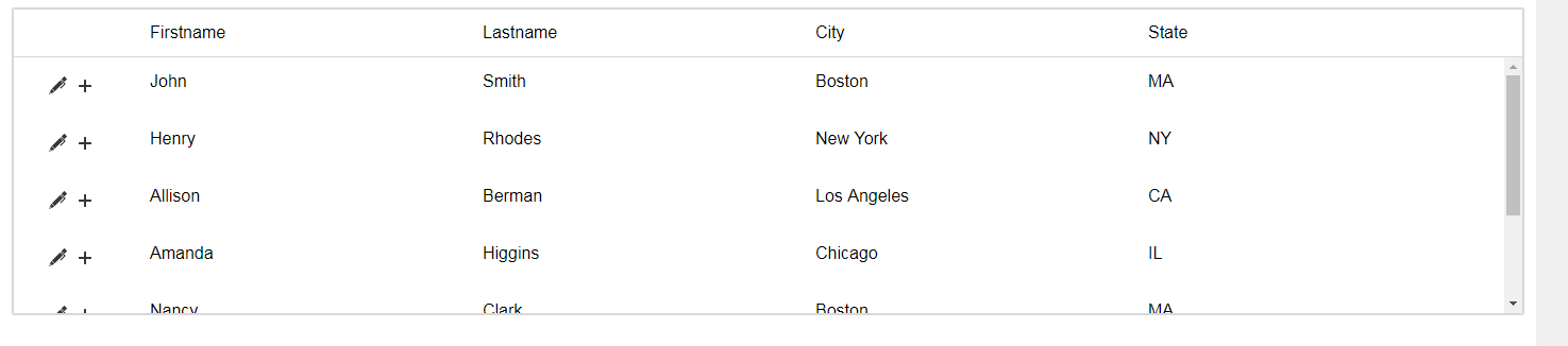
The image below shows a List with in-place editing enabled. Notice the icons in the first column of the List. These icons allow the user to edit a row or to add a new row to the List. You can also configure the List to support double-click to edit a List row. Once a row is in edit mode, a second double-click on the row will save the edit and return to view mode.
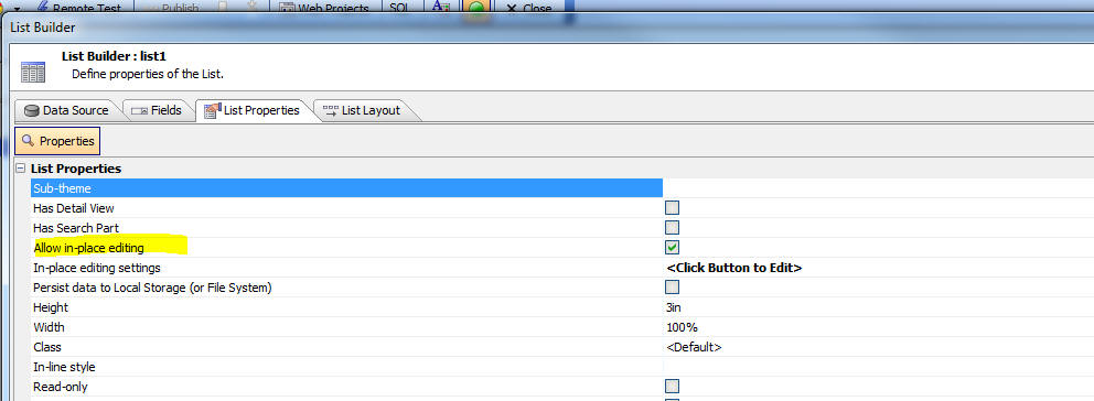
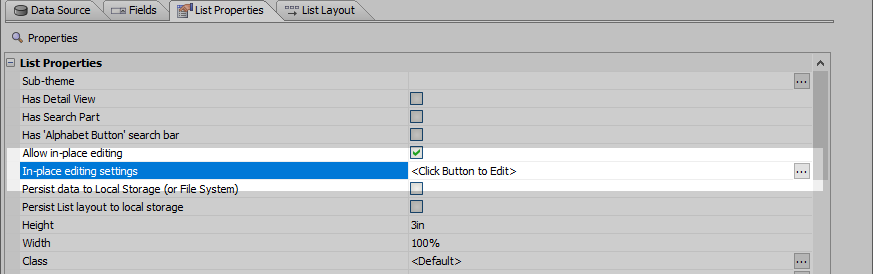
To turn on in-place editing for List, check the Allow in-place editing property in the List Builder on the List Properties pane.
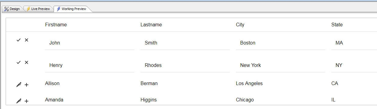
You can configure the List to only allow one row at a time to be in edit mode, or you can allow multiple rows at a time to be in edit mode, as shown in the image below:
You can put a row into edit mode by clicking the Edit icon in the row.

You can add a new row of data to the List by clicking the New Record icon.

You can delete a row of data by clicking the Delete Record icon. You can customize the icon with the Delete record icon property.
The image below shows the List after the New Record icon has been clicked. Notice that an empty new row appears in the List immediately after the row in which the icon was clicked. The fields in the new row can have default values that are computed using Javascript.
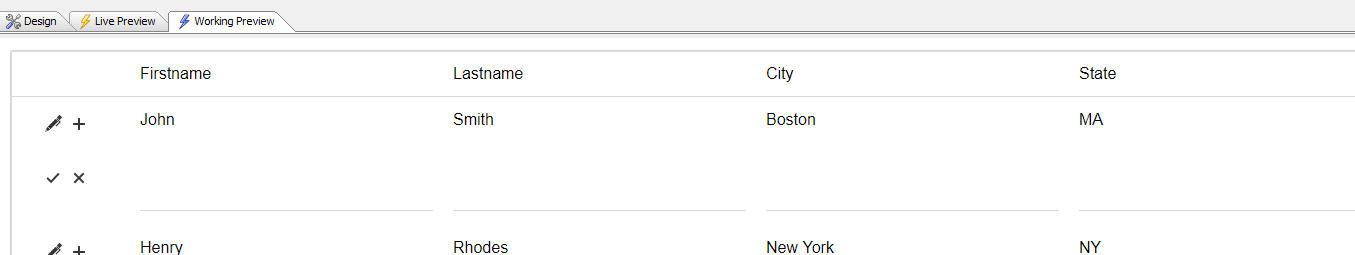
You can save the new row by clicking the Save icon (the checkmark icon), or you can abandon the new row by clicking the Cancel icon (the X icon).
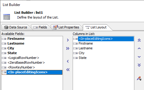
You can add the in-place edit icons to a List row by selecting the <In-placeEditingIcons> item from the list of Available Fields.
By default, you can also put a List row into edit mode by double clicking on the row. Once the row is in edit mode, a second double click will save the edits and return the List row to its 'non-editable' state.
If you use the double click method to put a List row into edit mode, then it is not required to add the <In-placeEditingIcons> to your List layout. However, without these icons, you will not be able to add a new row to the List unless you use some Javascript code.
Here is the Javascript code to add a new row to a List and to cancel the new Row:
var lObj = {dialog.object}.getControl('list1')
//add a new row below row 1 (zero based)
lObj.editInplaceAddRow(1);
//cancel the new row (zero based)
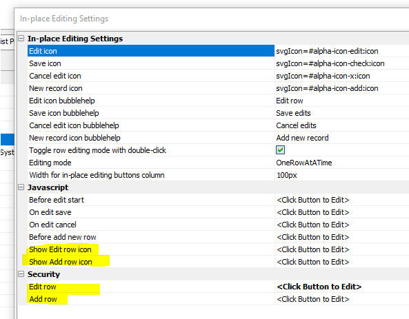
lObj.editInplaceCancel(2);You can configure whether double-click can be used to put a List row into edit mode and other List in-place editing settings by clicking the smart field for the In-place editing settings property.
When you click the smart field, the following dialog will open:
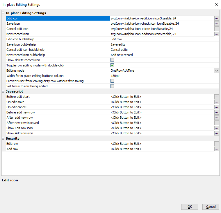
This dialog allows you to specify:
- Icons to use for the <In-placeEditingIcons>
- Whether double-click can be used to toggle a List row into or out of editing mode
- Width for the <In-placeEditingIcons> icons column in a Columnar List layout
- Whether the List should allow multiple rows, or just one row, to be in editing mode at a time
- Javascript events
- The Security groups allowed to access the Edit row and Add row actions.
The Javascript events fire before a List row goes into editing mode, when the edits in a row are saved, when a new row is added to the List, or when edits are cancelled. All of these events allow you to cancel the event by returning a false value.
Available JavaScript Events
- Event
- Description
- Before edit start
Fires before editing starts. Return false to cancel editing.
- Before delete row
Fires before a row is deleted. Return false to cancel the delete.
- After delete row
Fires after a row has been deleted.
- On edit save
Fires when the row is saved. Return false to cancel the save.
- On edit cancel
Fires when edits are cancelled for a row. Return false to cancel the action.
- Before add new row
Fires before a new row is added. Return false to cancel adding a new row.
- After add new row
Fires after a new row is added.
- After new row is saved
Fires when a new row is saved. Return false to cancel saving the new row.
- Show Edit row icon
Called before the Edit row icon is shown. Return false to cancel display of the Edit row icon.
- Show Add row icon
Called before the Add row icon is shown. Return false to cancel display of the Add row icon.
- Show Delete row icon
Fires when the delete row icon is added to the row. Return false to hide the delete icon.
The Before add new row event could be used to set default values for fields in a new row, and the On edit save event could be used to define data validation, but, as described later, you can use define Default value and Validation code for each field in the List.
Defining In-place Editing Properties at the Field Level
Once you have turned on in-place editing for a List you can define in-place editing properties for each field in the List. To define in-place editing settings for individual fields, go to the Fields pane in the List builder.

For each field you can specify:
- Whether in-place editing is allowed for the field.
- The control type to use for in-place editing. The available control types are:
- Textbox
- Edit-combo
- Auto-suggest
- Dropdownbox
- Datepicker
- Logical CheckBox
- CheckBox
- RadioButton
- Control settings - see below for more detail
- Client-side Validation - defined using JavaScript, this code is run when the user tries to save the edits in a List row. If the validation code returns an error message, the error is shown below the field and the List row remains in edit mode.
- Server-side Validation - defined using Xbasic, this code is run when edits are saved to the List row. Sever-side validation is executed after client-side validation and only if there are no client-side errors.
- Default value Javascript - this code is run when the user adds a new row to the List. Is sets the default value for the field.
For example, the the image below, the City field has a validation rule that has been violated:
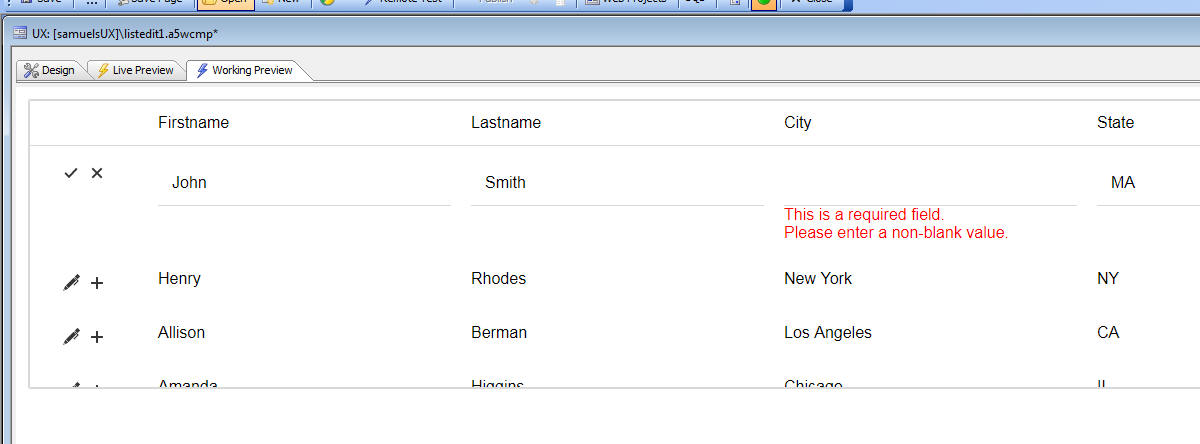
The validation rule for the City field was defined as:
if (newData.City == '') {
    return 'This is a required field.\nPlease enter a non-blank value.';
} else {
    return '';
}
Adding Server-side Validation
Server-side validation can be defined for a List with in-place editing.
To define the Xbasic validation code, open the List Builder, go to the Fields tab, select the field and then click on the smart field for the Validation - server-side property.
Enter the Xbasic code to validate the field. To return a validation error set the function's hasError property to .t. and set the function's errorText property to the error description.
Note that server-side validation requires a connection to execute. If no network connection is available, server-side validation is not run when the List row is saved.
Server-side validation code only executes when List edits are saved and only executes if the List row has been edited. Additionally, the server-side validation code is only executed if there were no client-side validation errors.
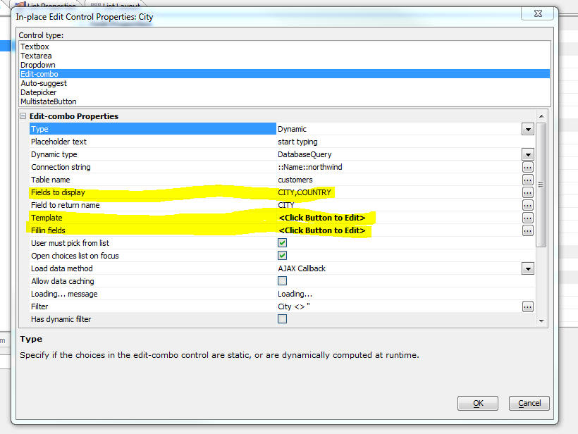
Control Settings
Click the Control Settings smart field to open the In-place Edit Control Properties dialog (as shown below).
This dialog allows you to select the control type to be used for in-place editing and to set properties for each control type.
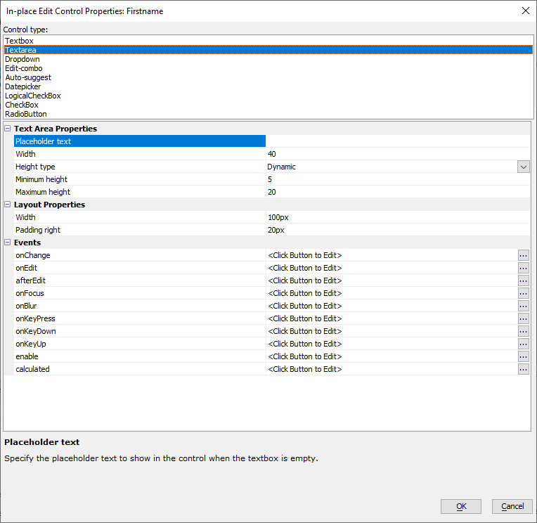
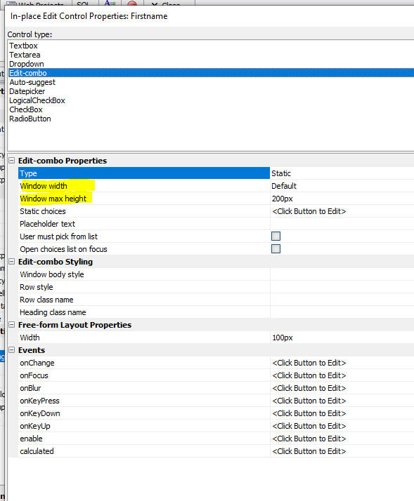
All of the available control types have a Width property which defines the width of the control when it is placed in a free-form List layout.
Each different control type exposes a different set of properties. Some of the control types (dropdown, edit-combo, auto-suggest) allow the user to pick a value from a list of choices. See Control Choices below for more details.
The Textarea control exposes these properties:
- Property
- Description
- Height type
Can be Dynamic or Fixed. If Dynamic, the height of the Text area control will depend on the value in the List row being edited. If Fixed you can specify a fixed number of rows for the control height. If the text being edited has more rows, then you can scroll the text vertically in the control.
- Minimum height
Applies when the Height type is Dynamic. Defines the minimum height of the Text area. For example, if the text in the field has 3 lines, but the Minimum height is set to 5, then when the List row is edited, the Text area will have a height of 5 lines.
- Maximum height
Applies when the Height type is Dynamic. Defines the maximum height of the Text area. For example, if the text in the field has 30 lines, but the Maximum height is set to 5, then when the List row is edited, the Text area will have a height of 5 lines.
Control Choices
The Dropdown, Edit-combo and Auto-suggest control all display a pick list of choices for the user to select from.
This pick list can be based on:
- A database query against a SQL database
- Custom Xbasic code that returns a list of choices (Use this option if you want to call a Web service to get the list of choices)
- Static - a static list of choices
- Javascript - some Javascript code that will return a list of choices. (The Javascript option is useful when building disconnected application where you store choice lists in the Client-side data cache.)
You can define a filter for the choices. For example, you might only want the choices in a Dropdown to show cities in the USA.
For the Edit-combo and Auto-suggest you can also define a dynamic filter. A dynamic filter is a filter that is based on data that has been entered in other fields in the List row being edited.
For example, say you have defined an Edit-combo control to edit the City field. Say that the List also has a Country field. When you are editing a List row and you click the down arrow to display the list of choices for the City field you might only want to display Cities for the Country entered into the Country field.
Edit-combo controls also support defining an Order, which let's you customize the order the list of choices.
Free-form Layout
You can use in-place editing in both Column List layouts and in Free-form layouts. In a free-form Layout you can specify the width of each control when the row is in edit mode. You can also define space (padding) to the right of the control.

Updating Data in a List Bound to a SQL Database
It is common to build List controls that are populated with data from a SQL database. You can easily use the List to make edits to the data in the SQL database by defining a Detail View for the List.
You might want to make these edits using in-place editing, rather than by entering edits into the List's Detail View.
Even though you intend to make edits using in-placed editing, you should still turn on the List's Detail View. However, you need not actually define any Detail View controls.
When you edit the data in a List row, an orange icon will appear in the edited List row to indicate the the List row has been edited, but not yet synchronized.
When you are ready to synchronize your edits you can click the Synchronize button (just as you would have had the edits been made in a standard List with Detail View).
How to Dynamically Change the Choices in a Dropdown Control Used for In-place Editing
The choices in a dropdown control can be dynamically changed at run-time using Javascript.
For example, in the code below, the choices for the Country field dropdown box are changed to 'alpha', 'beta', 'gamma'. In the case of 'gamma', a stored value of 'g' is defined.
var lObj = {dialog.object}.getControl('list1');
if (lObj) {
    lObj._inplaceEditing.choices.Country = ['','alpha','beta',['gamma','g']];
}
How to Render a Field with In-place Editing as a Checkbox when a Row is not in Edit Mode
The in-place editing only applies to fields with "Label" type. The other types don't have in-place editing options. The editing controls for the field are inserted when the row is switch to edit mode. If the field is a logical value that can only have two states, you may want to render the field as a logical checkbox when the row is not in edit mode.
You can use the Decode value property to render a field as a Checkbox without losing the ability to use in-place editing. To do this, enable Decode value. When configuring the Decode lookup list, select Static Choices and set the list of values to the example shown below. If your field uses other values for checked and unchecked, update the corresponding T and F as needed.
T|<input type="checkbox" checked readonly/>
F|<input type="checkbox" readonly/>
The lookup value can contain HTML, as shown in the example above. When the field has a value of F, a unchecked checkbox will be rendered. When the value is T, a checked checkbox is rendered. The readonly attribute ensures the user cannot change the value of the checkbox when the row is not being edited.
Editing All Rows At Once
When a List is initially rendered, you might want all of the rows in the List be in edit mode (so that the user does not have to manually put a row into edit mode before making edits).
The following Javascript methods of the List can be used:
- Method
- Description
- editInplaceEditAll()
puts all rows into edit mode
- editInplaceSaveAll()
saved all rows with edits
- editInplaceCancelAll()
cancels edits in all rows that are in edit mode
For example:
var lObj = {dialog.object}.getControl('list1');
if (lObj) {
    lObj.editInplaceEditAll();
}
Styling Edit-combo and Auto-suggest Pick Lists
You can define several properties to control the styling of the pick-lists displayed for edit-combo and auto-suggest controls.
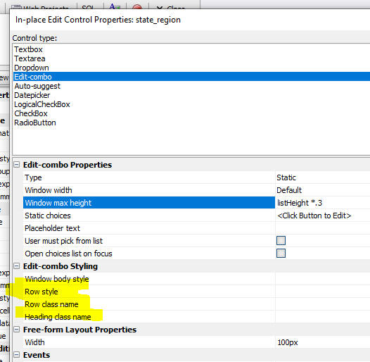
You can control the height of the pick-list window that is displayed for edit-combo and auto-suggest controls. You can use the special listHeight value to specify a value relative to the List height. For example: listHeight * .3
Conditionally Controlling with Controls Allow In-place Editing
You can define a Javascript function to determine if a particular field in the list should be editable when the List row is put into edit mode. You can also specify security groups to control whether a particular field is editable.
By default all of the fields that have their Allow edit property checked become editable when the row is put into edit mode. However, if you specify a Javascript function that returns false, then when the List row is put into edit mode, the field will not be editable.
You can specify global JavaScript functions, functions defined in the scope of the UX component (e.g. {dialog.object}._functions.somefunctionname), or functions defined in the scope of the List control (e.g. [scope].somefunctioname):
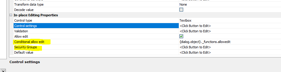
To define the Security Groups for a field, set the Security Groups property in the Fields pane in the List Builder. See image above.
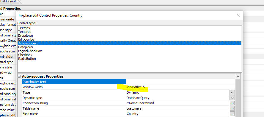
Controlling the Pick-List Window Size for Edit-combo and Auto-suggest Controls
You can set the width and maximum height of the pick-list window for edit-combo and auto-suggest controls. The default window width is the width of the control.
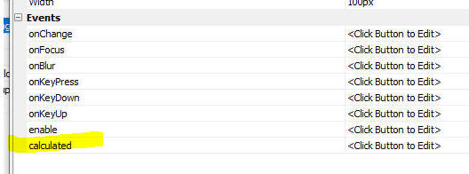
Calculated Fields
When you are editing the data in a List row, you can specify that the value in a particular field should be computed from other data in the List row. Your JavaScript code that computes the calculated value can reference the current (i.e. edited data) in the List row, the original data in the List row, or data from other rows in the List.
To define a calculated field, specify code in the control's calculated event.
For example, if the List has these columns: price, quantity and total, you might specify this code for the calculated event for the total field:
return Number(newData.price) * Number(newData.quantity)
Notice that the Number() function is used to ensure that the value for price (newData.price) is a numeric value.
The value for price is prefixed with newData (as opposed to oldData) to indicate that you want to use the current (edited) value that the user has typed into the price field. oldData.price refers to the value before the user made any edits.
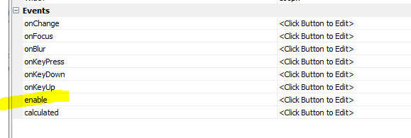
Dynamically Enabling In-place Editing Controls
You can dynamically enable/disable controls in the List row you are editing.
To enable or disable a control while you are editing a List row, define an enable event. Your event can reference data in the row you are editing and also the original data (before edits were made). If your code returns false, the control is disabled. Otherwise the control is enabled.
When radiobutton and checkbox controls are disabled an opaque overlay is shown over the control to give a visual clue that all of the controls in the control group have been disabled.
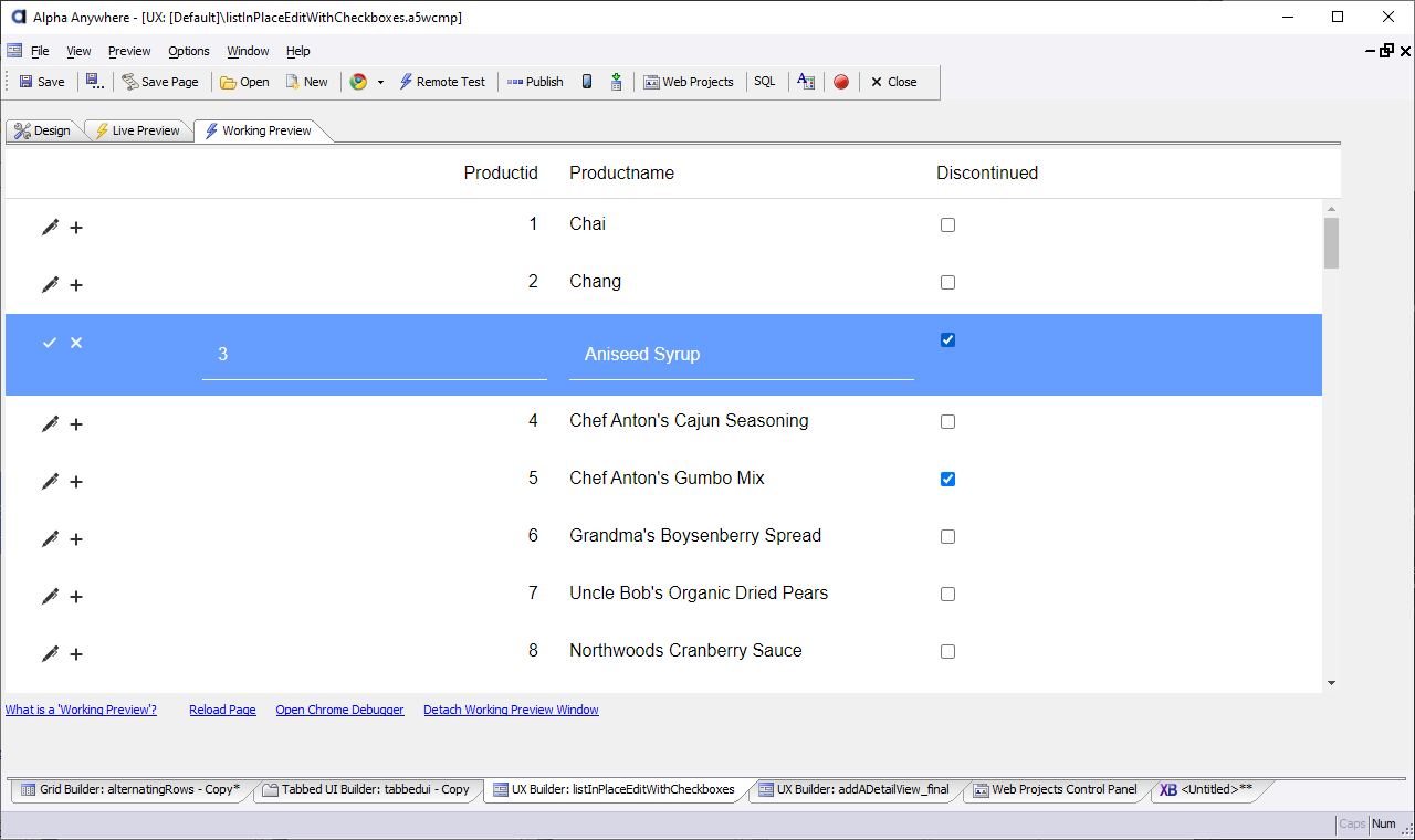
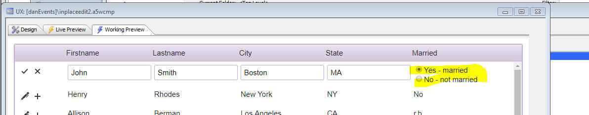
In-place Edit - CheckBox and RadioButton Controls
You can specify that the data in a List column should be edited using either a CheckBox or RadioButton control. When you define the choices for these control types you can define a static list of choices. Each choice can define an optional stored value in addition to a displayed value. The individual radiobutton or checkbox controls can be rendered using a horizontal, vertical or snaking layout (multiple columns that snake from left to right, top to bottom within the defined width of the List column).
In the image below, the RadioButton control has been defined to use a vertical layout.
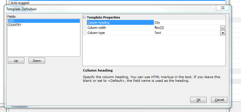
Auto-suggest and Edit-Combo - Multi-column Pick List and Fill in Fields
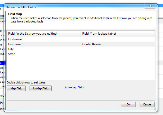
When defining auto-suggest and edit-combo controls for in-place editing in a List you can specify that the Pick List that is displayed should have multiple columns. You can also specify that when a selection is made from the Pick List other fields in the List row you are editing should be filled in with values from the Pick List (the source fields for the fill in definition do not have to be displayed in the Pick List).
In the image below, the City field is defined as an edit-combo control and the Pick List shows two columns - City and Country. You can specify the column headings and the column widths. (See below).
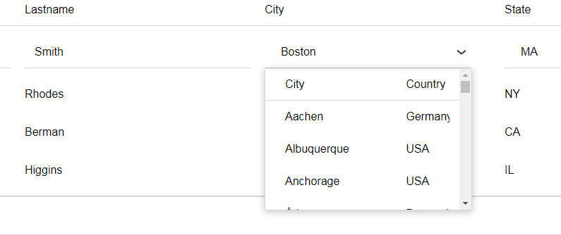
To specify that the Pick List for an edit-combo or auto-suggest control has multiple columns, select the columns to display by setting the Fields to display property.
If you are displaying more than one field in the Pick List you can customize the template used to display the Pick List. Click the smart field for the Template property.
You can control the order in which the columns are displayed (by clicking on the Up and Down buttons) and you can set these properties:
- Property
- Description
- Column heading
By default, the column heading is the same as the field name. You can use HTML markup in the heading.
- Column width
By default, all columns have a width of flex(1), which means that the columns are equal size within the overall width of the Pick List. You can set the size of a column to be relative (i.e. flex(2), which means that the column is twice the width of other columns that are set to flex(1), or you can set an absolute size (e.g. 100px).
- Column type
Can be Text or Image. Specify if the data in the column is text or an image name.
- Image Style
If the Column type is set to Image you can specify an image style. This is typically used to set the size of the image (e.g. width: 75px);
When the user makes a selection from a Pick List you can fill in other fields in the List row you are editing. To define which fields should be filled in, click the smart field for the Fillin fields property.
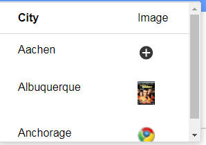
Displaying Images in a Pick List
The image below shows a Pick List with two columns. The data in the second column is displayed as an image (this is done by setting the Column type to Image in the Template).
In the first row a built-in SVG image is displayed. In the second row an image referenced by a URL is shown and in the third row a built-in image is shown.
Events
You can define the following events for in-place editing controls
- onChange
- onFocus
- onBlur
- onKeyPress
- onKeyUp
- onKeyDown
- onEdit
Triggered when the List row goes into edit mode. This event can be used to format the data for editing. See onEdit and afterEdit Events below for more information.
- afterEdit
Triggered when the List data is saved. This event can be used to un-format data. See onEdit and afterEdit Events below for more information.
Not all input-editing control types support the full list of events.
onEdit and afterEdit Events
The onEdit and afterEdit events can be used to apply custom formatting to the data before displaying it in the in-place editing control for the field.
For example, assume you have a List that has a field called "DOB" (date of birth), and the data type of this field in the list's SQL data source is datetime. If the regional settings of the machine running the Application Server is set to US (United States), the data in the list will be stored in this format: MM/dd/yyyy. So, a particular value might be 12/24/1972.
You may prefer to display the value using a different format, such as dd.MM.yy. This format can be applied by setting the Date/time display format property as shown in the image below:

After applying the formatting, the List will display the date value 12/24/1972 as 24.12.72. However, when the List row is put into edit mode, the value in the in-place editing field will be displayed as 12/24/1972. This happens because the actual value that is stored in the List's data is 12/24/1972.
In-place editing values must be formatted using the onEdit and afterEdit events if you want them to match the formatted displayed value. For example, to format the DOB field to match the Date/time display format specified above, you could add the following JavaScript to the onEdit event:
var d = new Date();

//parse the date value string using the format that it is currently stored in
d.fromFormat(data.dob,'MM/dd/yyyy');

//generate a date string in the required format
data.dob = d.toFormat('dd.MM.yy');
When the row is saved, you must also translate the value back into the format stored in the list's data source. This is done using the afterEdit event. Using the example above, the JavaScript shown below translates the DOB value back into the expected format:
var d = new Date();
d.fromFormat(data.dob,'dd.MM.yy');
data.dob = d.toFormat('MM/dd/yyyy');
Security
If the Alpha Anywhere Security Framework, security restrictions can be applied to the following actions:
- Edit row
- Add row
If security is not explicity set for an action, all users will have permissions to use the action.
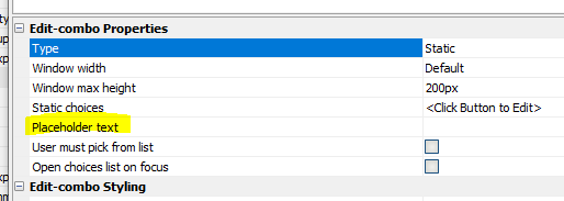
Placeholder Text
You can define placeholder text to be displayed in the input controls used for in-place editing.
In the image below, placeholder text is displayed in the input controls for Lastname and City in the new row.
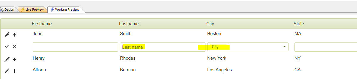
To define placeholder text for a field, set the Placeholder text property in the In-place Edit Control Properties dialog.
Methods
Available methods for a List with in-place editing enabled:
listObj.editInplaceAddRow()
Adds a new row to a List with in-place editing. Eg:
var lObj = {dialog.object}.getControl('LIST1');
if (lObj) {
    // Add a new record at row 3.
    lObj.editInplaceAddRow(2);
}
See listObj.editInplaceAddRow Method for more information.
listObj.editInplaceCancel()
Cancels edits to a row in an List with in-place editing.
var lObj = {dialog.object}.getControl('LIST1');
if (lObj) {
    // Cancel edits to the third row in the list:
    lObj.editInplaceCancel(2);
}
See listObj.editInplaceCancel Method for more information.
listObj.editInplaceCancelAll()
Cancels all edits to the List with in-place editing.
var lObj = {dialog.object}.getControl('LIST1');
if (lObj) {
    lObj.editInplaceCancelAll();
}
See listObj.editInplaceCancelAll Method for more information.
listObj.editInplaceEditAll()
Puts all rows in edit mode in a List with in-place editing.
var lObj = {dialog.object}.getControl('LIST1');
if (lObj) {
    lObj.editInplaceEditAll();
}
See listObj.editInplaceEditAll Method for more information.
listObj.editInplaceEditRow()
Puts a single in edit mode in a List with in-place editing.
var lObj = {dialog.object}.getControl('LIST1');
if (lObj) {
    ' Edit the first row in the list:
    lObj.editInplaceEditRow(0);
}
See listObj.editInplaceEditRow Method for more information.
listObj.editInplaceSaveAll()
Saves all rows in edit mode in a List with in-place editing.
var lObj = {dialog.object}.getControl('LIST1');
if (lObj) {
    lObj.editInplaceSaveAll();
}
See listObj.editInplaceSaveAll Method for more information.
listObj.editInplaceSaveRow()
Saves edits to a row in an List with in-place editing.
var lObj = {dialog.object}.getControl('LIST1');
if (lObj) {
    // Save edits for the third row in the list:
    lObj.editInplaceSaveRow(2);
}
See listObj.editInplaceSaveRow Method for more information.
Videos
In-place editing
By default, a List control is used to display data, not to edit data. It is possible to edit the data in a List using either a List Detail View, or using in-place editing.
In this video, we show how you can configure a List to use in-place editing.
In-place editing - Dropdown Control
In this video, we show how a dropdownbox can be defined for in-place editing of data in a List.
In-place editing - Dynamically changing choices in a dropdownbox at runtime.
A common pattern when using Lists that allow in-place editing is to configure the List so that all rows in the List are in edit mode (rather than requiring the user to put individual rows into edit mode before making edits).
In this video we show how you can execute Javascript to put all of the rows in the List into edit mode.
In-place editing - Putting all rows into edit mode.
A common pattern when using Lists that allow in-place editing is to configure the List so that all rows in the List are in edit mode (rather than requiring the user to put individual rows into edit mode before making edits).
In this video we show how you can execute Javascript to put all of the rows in the List into edit mode.
In-place editing - Free-form Layouts
In place-editing in a List control can also be used in free-form List Layouts.
In this video we show a List that has a free-form layout and how in-place editing can be used.
Using in-place editing to edit data in a List based on a SQL table
To edit data in a List that is based on a SQL database, the List/Detail View pattern is typically used. However, it is also possible to use in-place editing in a List and then persist the edits made to the List back to the SQL database.
In this video we show how a List that is based on a SQL database is configured to allow edits to the SQL database to be made using in-place editing in the List.
Data validation for in-place editing
When you use in-place editing to edit data in List row you can use Javascript code to validate the edited data before it is saved.
In this video we show how a validation rule is added to check that the user enters a value into the City field.
In-place editing - Auto-suggest
You can define an auto-suggest control for in-place editing. You can also dynamically filter the choices in the auto-suggest based on other data entered into the List row being edited.
In this video we show how an auto-suggest control that shows choices from a SQL database is defined. We then add a dynamic filter to the auto-suggest so that it only shows choices that are filtered by some previously entered data in the List row.
In-place editing - Displaying images in a pick-list for Edit-combo or Auto-suggest
When you define the data to be shown in the pick-list for an edit-combo or auto-suggest control, you can include images. In this video we show how the pick-list for an edit-combo is configured to display images
In-place editing - Displaying multiple columns in a pick-list for Edit-combo or Auto-suggest
When you define the data to be shown in the pick-list for an edit-combo or auto-suggest control, you can specify that multiple columns of data should be shown in the pick-list. You can also specify that when the user makes a selection from the pick-list that other fields in the List row you are editing should be filled in. In this video we show how this is done.
In-place editing - Enable/Disable controls
When you are editing the data in a List row using in-place editing, you may want to dynamically enable/disable controls in the row.
In this video we show how you can define an enable event to dynamically disable controls in the List row you are editing.
In-place Editing - Server-side validation
In this video, we show how data validation for fields in a List that are edited using in-place editing can be validated both client-side (using Javascript) and server-side (using Xbasic).